Aussie homepage redesign
10 minute read
A redesign of the homepage to future-proof and align the Aussie experience to Lendi.
Intro
As part of the acquisition of Aussie Home Loans, we are rebuilding and migrating the existing Aussie CMS onto the same platform as the Lendi website.
In doing so, the wider product strategy is to align and unify the Aussie and Lendi experience, allowing design and engineering teams to future-proof and seamlessly scale both websites.
To start this journey, the first experience we'll be tackling is the Aussie homepage.
Duration
6 months
Team
Product Owner, Marketing Product Manager, Technical Lead, 3 Full Stack Engineers and QA.
My role
Lead Product Designer
Research
Methods
I used Google Analytics to gather quantitative data about the performance of the current Aussie homepage, and the broader website experience. The insights gathered helped to better understand the current website experience, identifying existing pain points and opportunities for improvement.
Objectives
Review Aussie's current homepage performance
Learn how visitors interact with the CMS
Identify high traffic areas/poorly performing areas
Insights
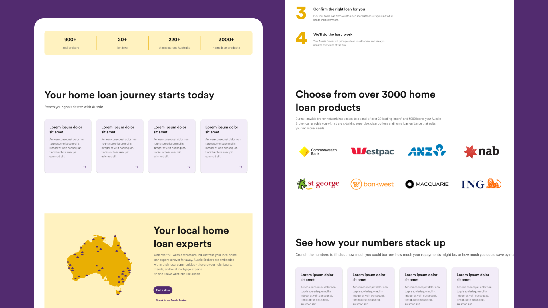
Page performance
The homepage is a frequent and highly visited page. There are opportunities to promote user engagement, extend time on the page and reduce bounce and exit rates.
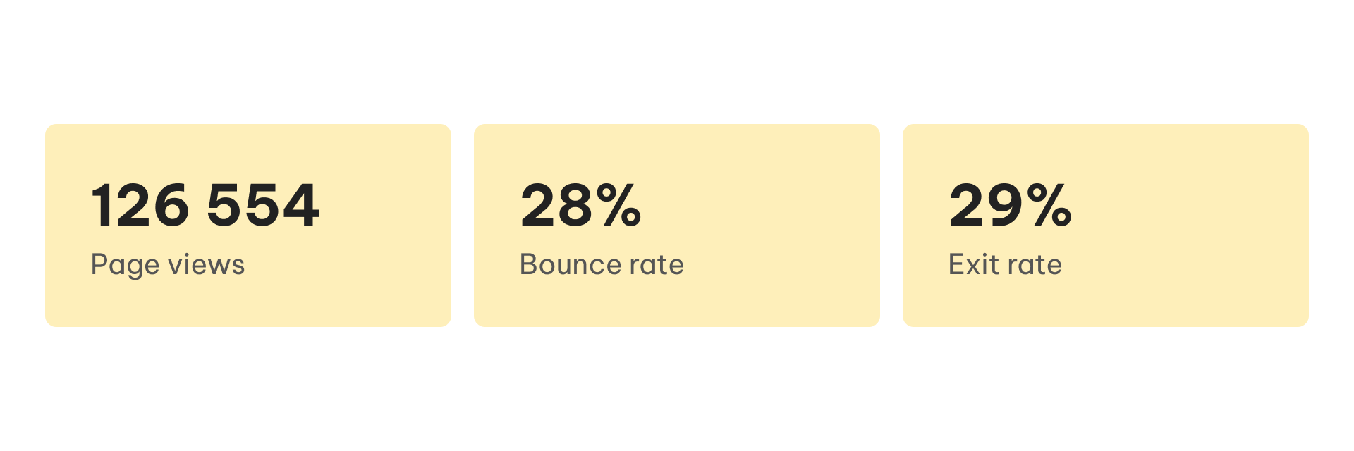
User types
There are equal parts of returning and new visitors which means it is equally as important to create experiences for existing customers and first-time visitors. This could mean the homepage dynamically changes the type of content and CTAs displayed depending on who is visiting and at which part of the customer journey they’re in.
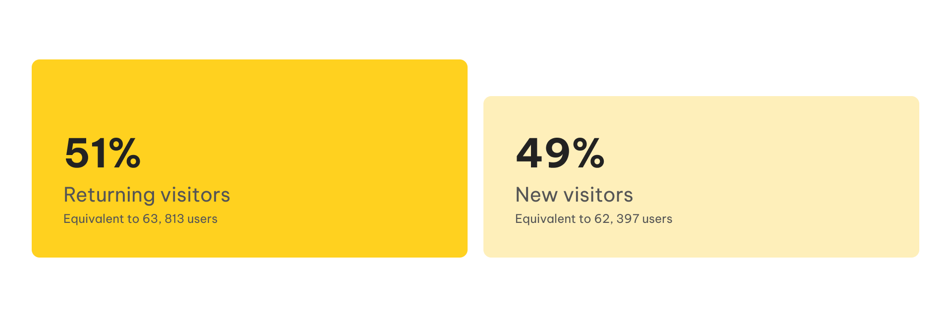
Devices used to view Aussie's homepage
It is imperative we prioritise desktop and mobile design as most users visit the homepage from those devices.
Screen resolution
Most users visit the homepage from a large widescreen desktop (1920x1080), then from an iPhone XS Max (414x896). The smallest mobile devices used to view the homepage are the iPhone 6-8.
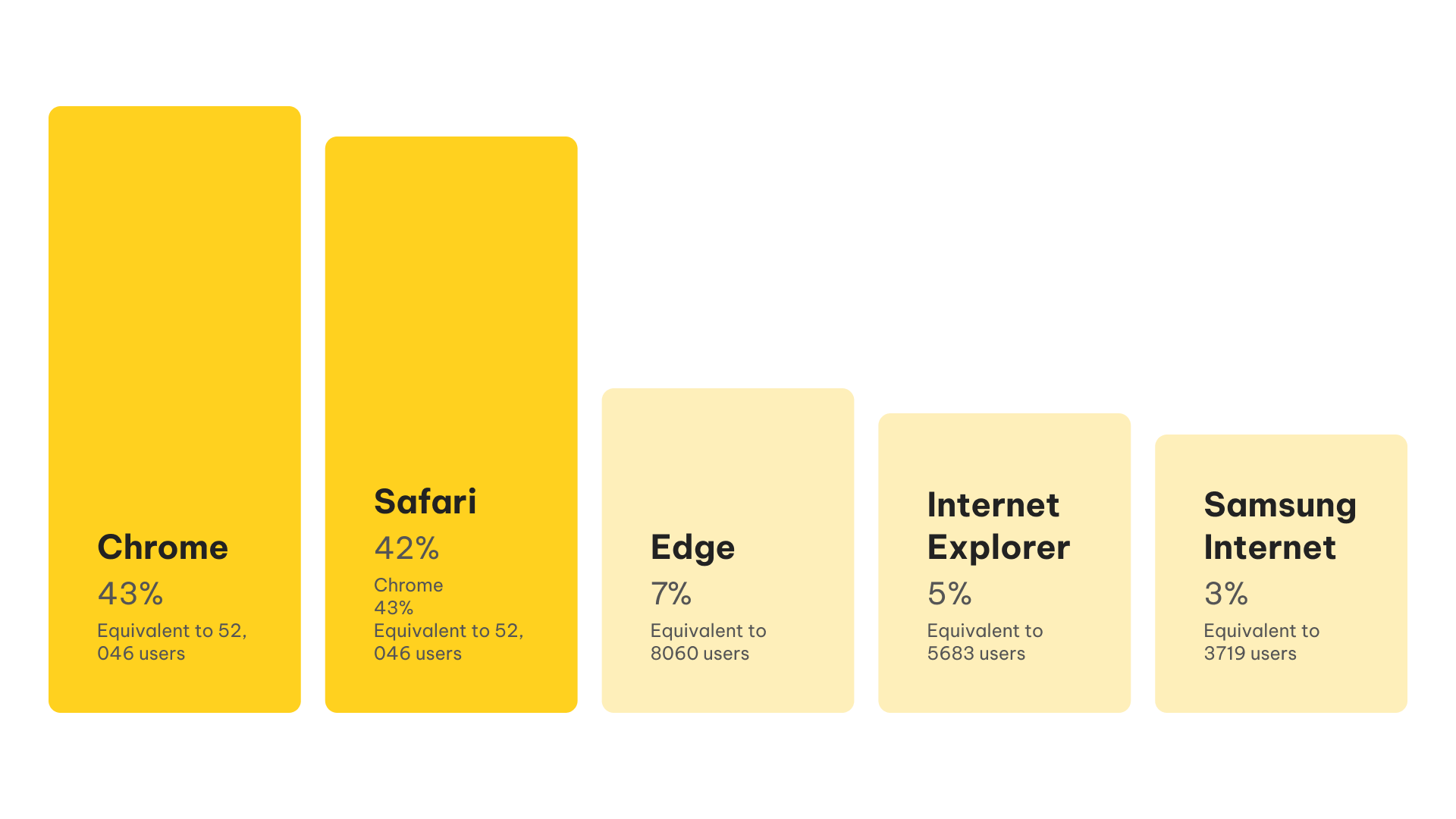
Browser
When testing the design, make sure to prioritise testing on Chrome and Safari.
Source and Mediums
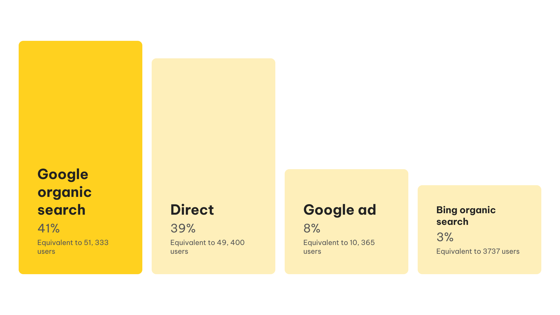
Most users visiting Aussie’s website already know of Aussie as they are searching for us organically, if not, visiting us directly.
Exit page
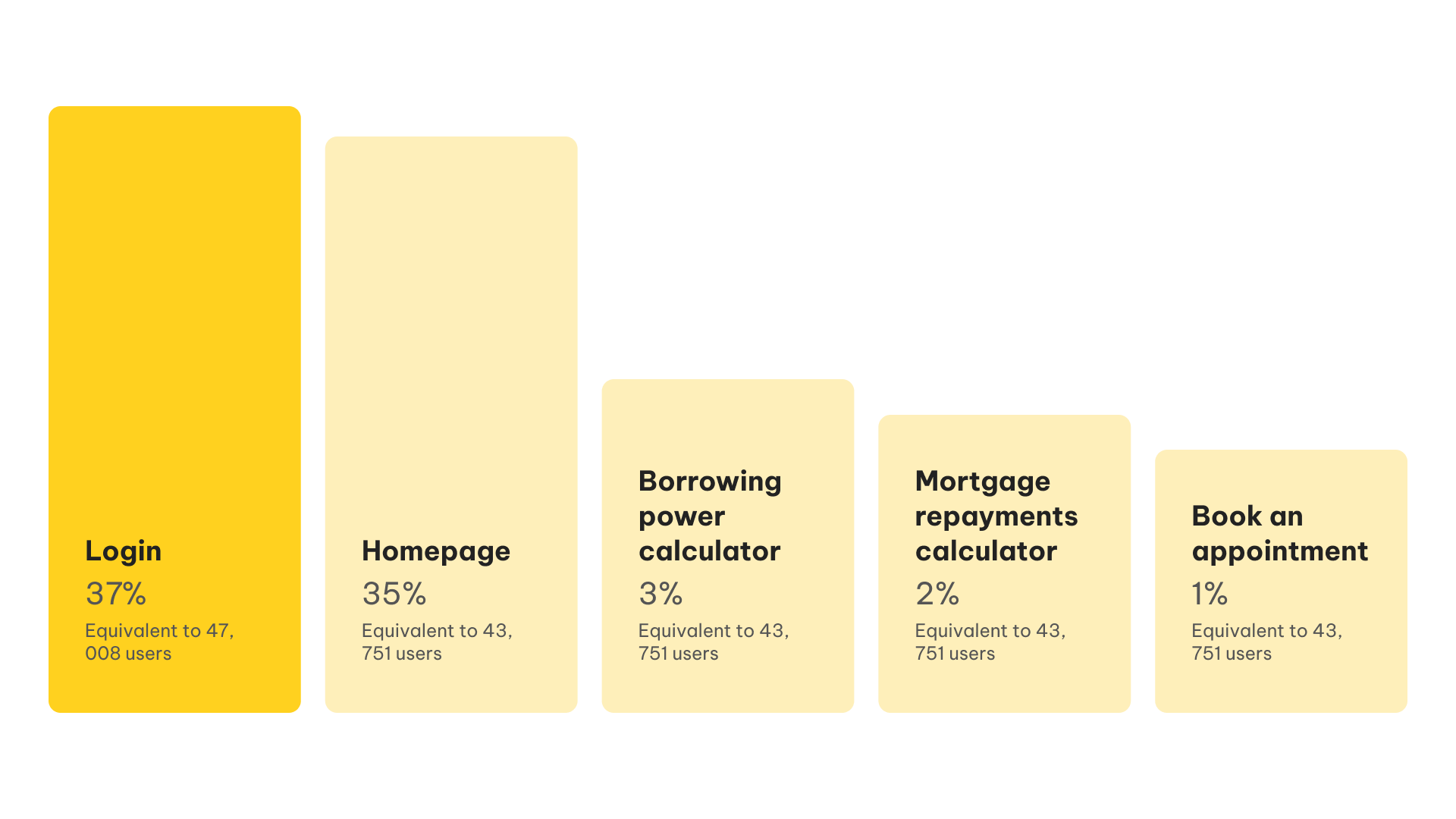
The majority of users visit the homepage and leave once they’ve gone to log in.A large group of users visit and leave the homepage. This could mean there are a lot of visitors who can’t find where they need to go easily and leave.
Popular user flows
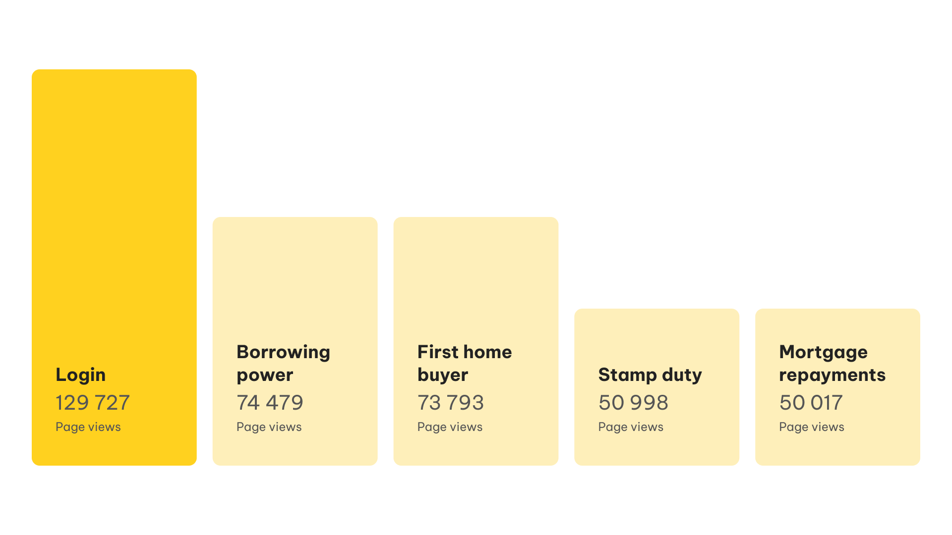
It's important we make the most frequently visited areas easily accessible from the homepage and navigation.
Define
Leveraging our insights, I worked closely with our Product Manager and Technical Lead to set key objectives and success metrics.
Objectives
Redesign the current homepage experience to make the Aussie funnels accessible
Design and build a scalable and modular CMS that can be themed across brands
Design and build a scalable and modular CMS that can be themed across brands
Success metrics
Increase click-through-rate for refinance and new purchase funnels
Increase time on site
Defining the scope
Working with our Product Manager, Tech Leads and Marketing stakeholders, we worked together to define the requirements of this project. We were able to brainstorm all the features we needed, then prioritised them to form a MVP and determine which features could be backlogged for a later time.
User stories
To better understand our customers, we were able to segment the group into 3 user types: first home buyer, homeowner and returning customer. From here, we created user stories to better understand the needs of each customer, as well as, becoming a key metric to determine success.
As a first home buyer, I want to learn more about how the home loans application works, so that I am more educated about what is expected in this process.
As a homeowner, I want to start an application, so that I can refinance my home loan.
Adopt LUI Next (Lendi's Design System) theme-able components
As a returning customer, I want to continue with my application, so that I can complete it and proceed to the next step of my home loans journey.
Design exploration
Shifting our focus from numbers, I spent some time exploring the Aussie homepage and broader website, to experience the website for myself and therefore empathise deeper with our customers.
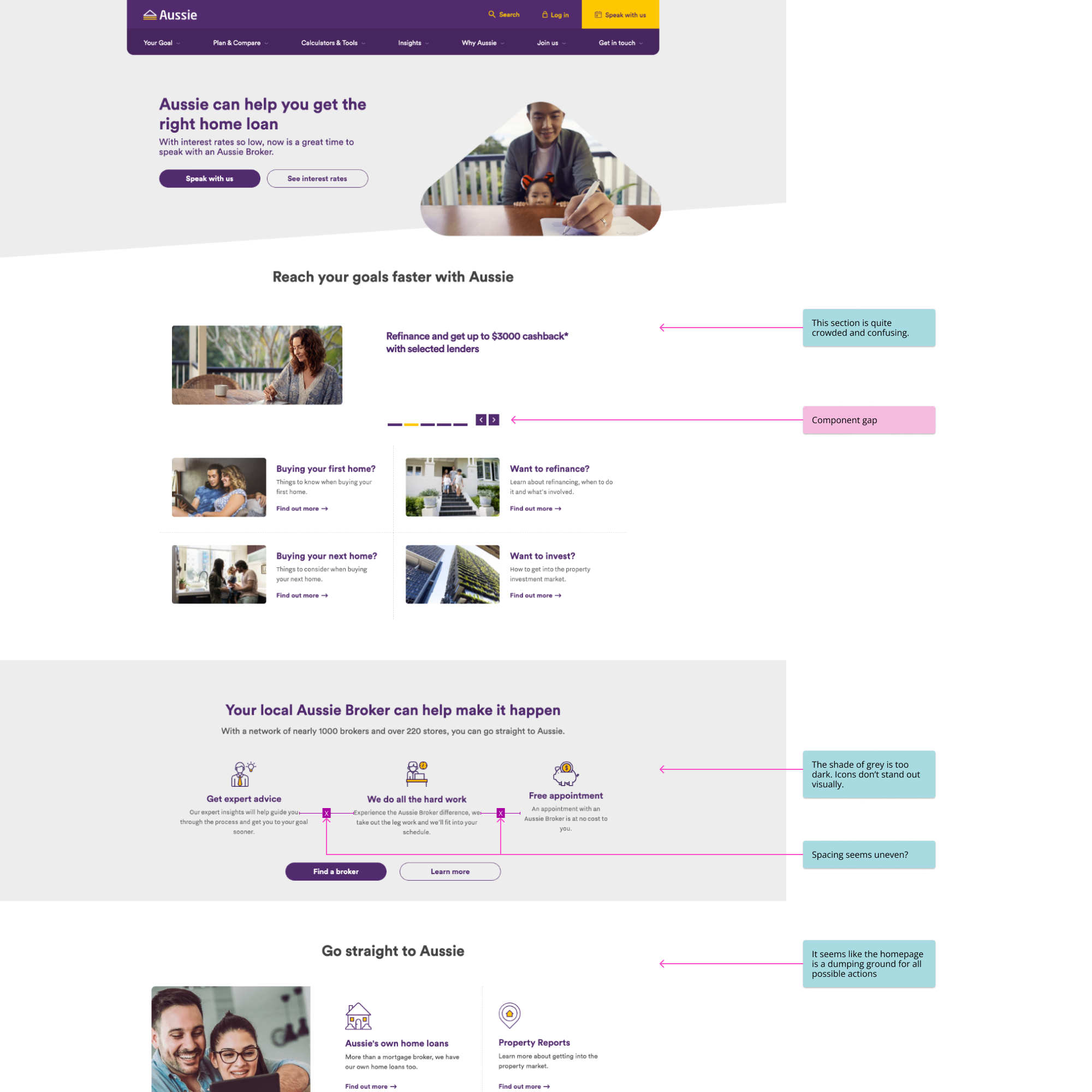
Analysing the current Aussie experience
The purpose of this is to identify feature and component gaps between Aussie and Lendi, and other pain points the customer may experience currently across different breakpoints.
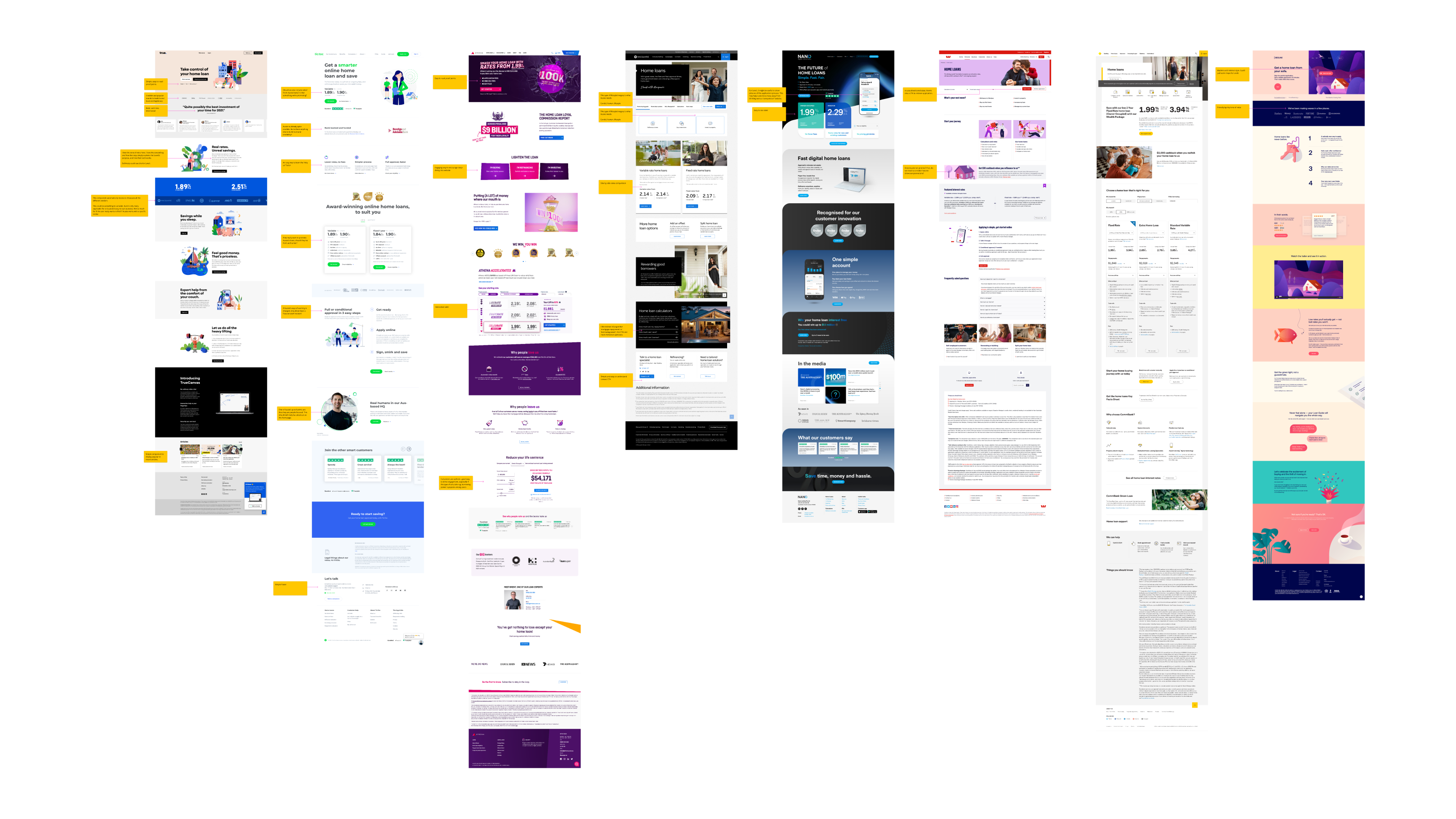
Competitor analysis
The purpose of this was to learn what our competitors are showcasing on their homepage - what they do well and not so well. The competitor analysis also allows us to identify the types of content we should consider including in our own homepage.
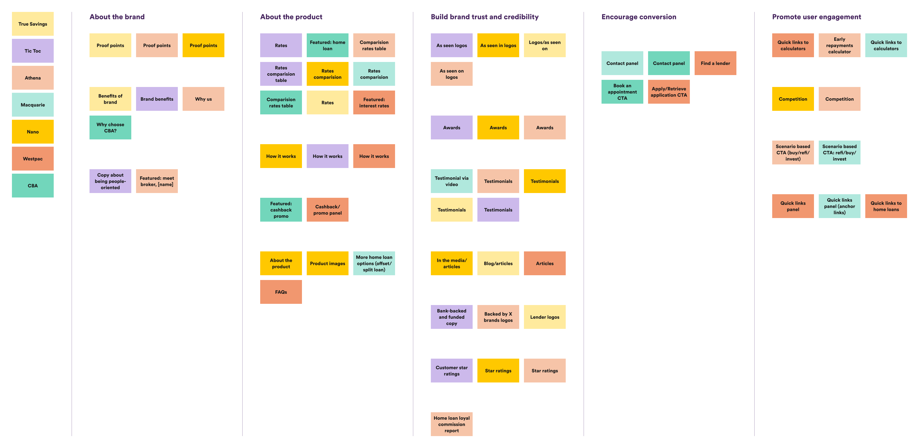
Content exploration
To determine what types of content our homepage should contain, I first had to see what our competitors were showing and learn more about what our customers would want to see.
Objectives
Identify what content our competitors are showcasing
High-level content planning for homepage
Content mapping
From a selection of competitors, I browsed through each homepage and noted down the types of content they showed. Once this was completed, I was able to group similar content together to reveal what content was relevant and frequently shown. Additionally, I was able to determine the value each type of content created, which helped better inform what content to include on our homepage, based on our Aussie brand strategy.
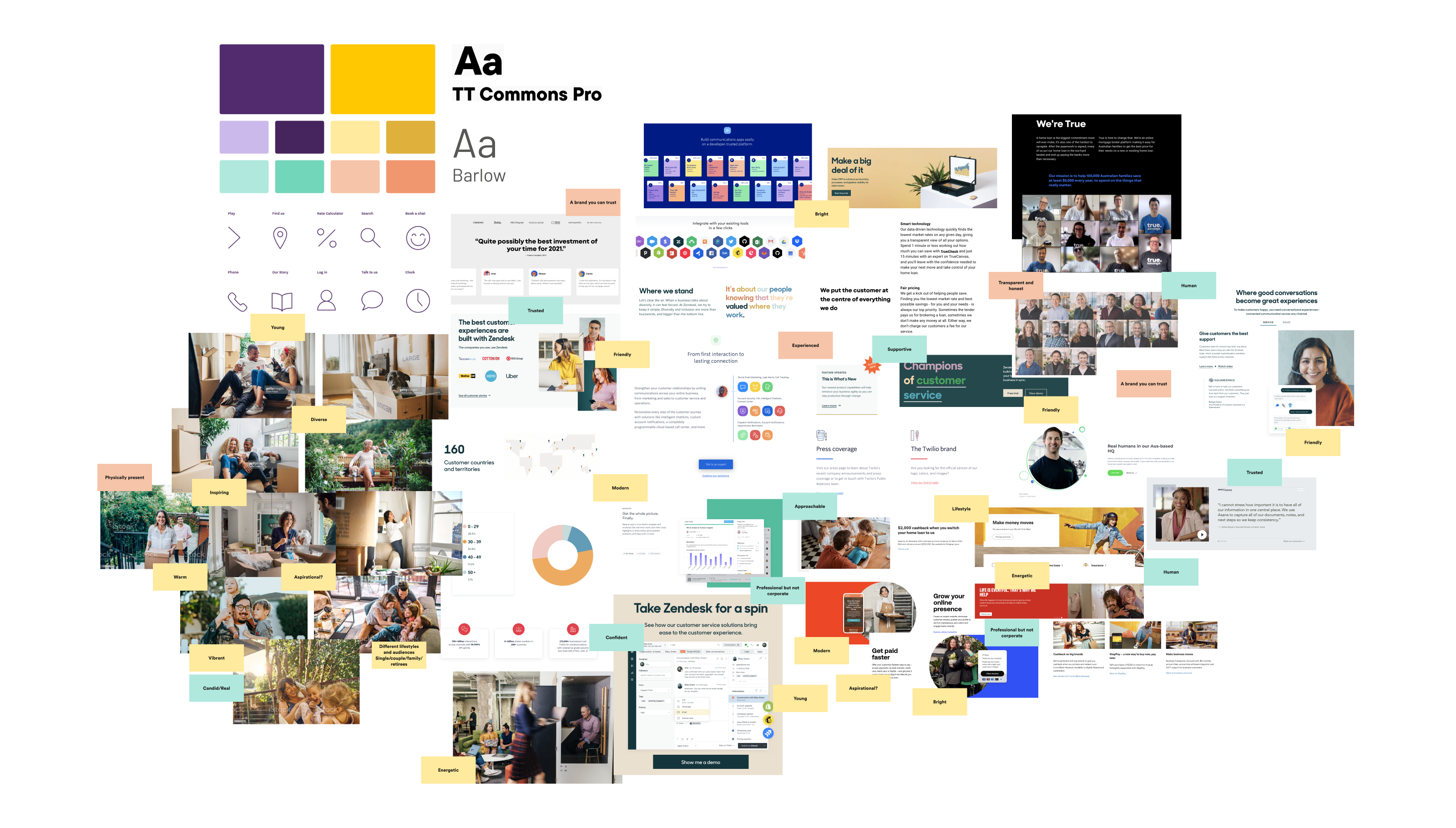
Branding exploration
Who is 'Aussie'?
I worked closely with our Marketing team to learn more about the Aussie brand and strategy. From the acquisition, our Marketing team are wanting to make small changes to the brand, which was important for me to understand, so that those changes are reflected in my design.
Branding workshop
I conducted a small workshop with our Marketing team to align our views on what we wanted the updated Aussie brand to be.
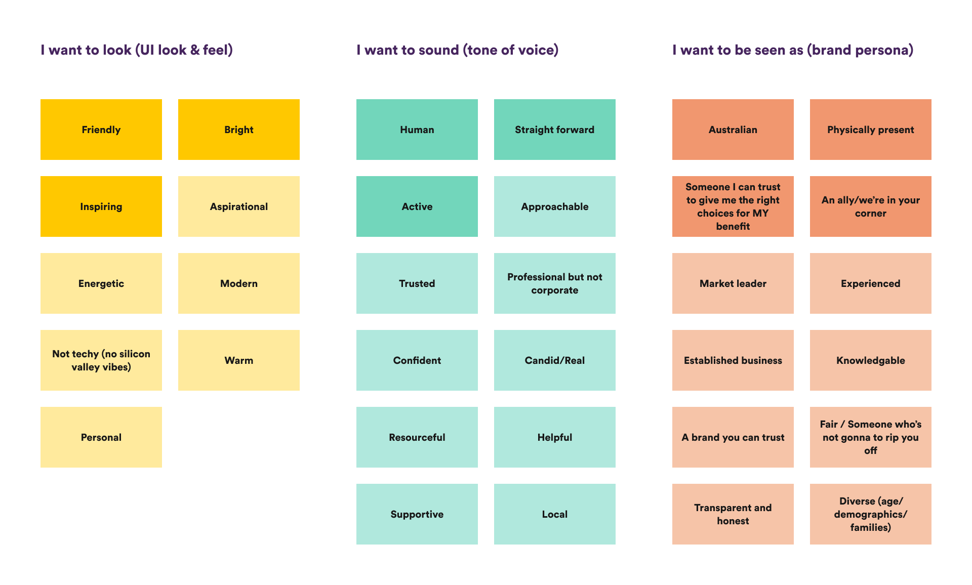
Moodboarding
Taking the findings from the branding workshop, I began moodboarding and assigning the keywords from the workshop to the moodboard, so that our stakeholders could understand how each design element would tie back into the defined brand values.
Ideation
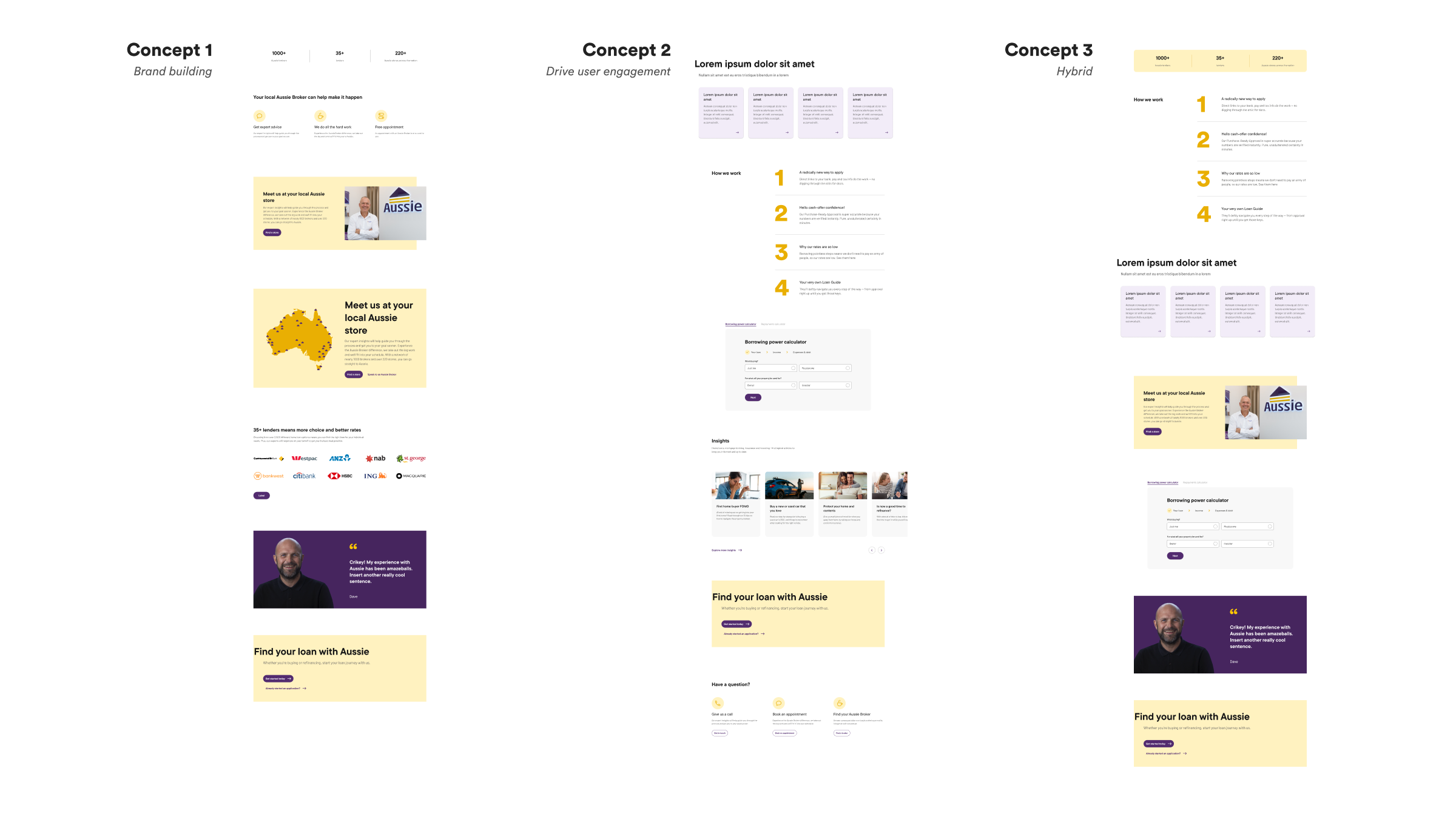
Lo-fidelity wireframes
To begin the ideation phase, I created 3 concepts based on the key strategy focus our Marketing team had mentioned. Upon review, we decided a hybrid strategy would work best, where our primary objective is to drive conversion and engagement, and our secondary objective it to continue building and elevating the Aussie brand.
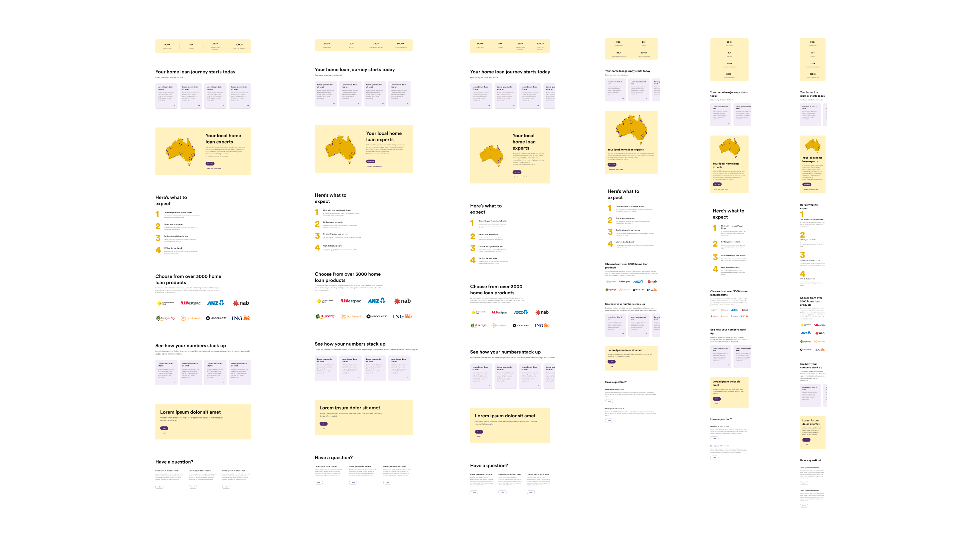
Hi-fidelity wireframes
In my hi-fidelity wireframes, I took Concept 3 and worked more on refining the UI and defining more details. The key elements I focused on here was:
Ensuring components were pixel perfect
Defining the colours, typography, spacing
Designing across breakpoints
High-level thinking of the different variants each block (section) could have
Defining and finalising the types of content required, for Marketing to start copywriting
Design handover
Breaking down the design
Once the homepage design was approved by our stakeholders, I began the documentation process, in preparation for development.
To build the homepage, we broke down the design into 'blocks' or sections, as the blocks used in the design ultimately formed part of the wider collection of modular blocks we'd eventually build and offer for our Marketing teams to use and edit.
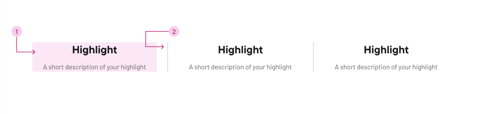
The anatomy
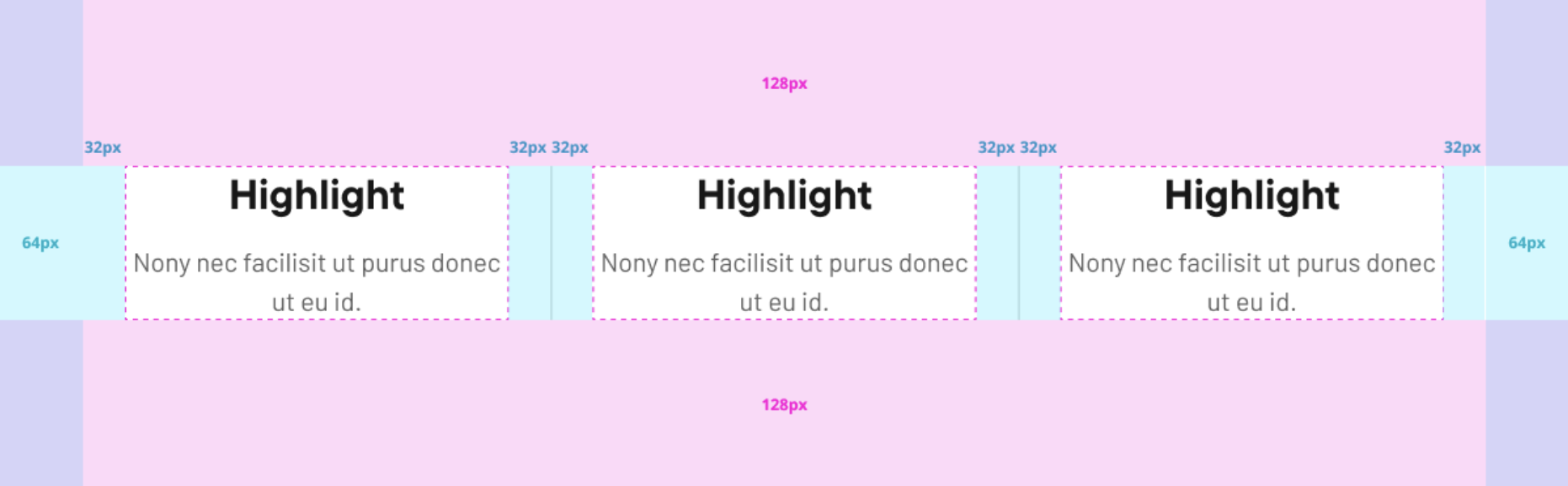
I created an anatomy diagram for each block, listing the different elements and components of each block.
Alongside this, I also mapped out the different spacing values which acted as an easy visual for our developers to follow, and became a conversation starter on how I envisioned the block to be built.
Details and specifications
I created an anatomy diagram for each block, listing the different elements and components of each block.
In my handover documentation, I provided the developers with
The different block variations
The controls given to Marketing users
Details on how the block and components should behave across breakpoints
Text tags; and min and max characters
Specifications to meet accessibility standards and other best practices
Alongside this, I also mapped out the different spacing values which acted as an easy visual for our developers to follow, and became a conversation starter on how I envisioned the block to be built.
Results
Goal 1 – On average, 5 seconds to clock-in and out of a simple shift
Result – Achieved 5 seconds on average time to clock-in and out of a shift ✅
Goal 2 – 95% task success rate
Result – Achieved 97% task success rate ✅
Goal 3 – 56 NPS score = happy workers = happy Deputees
Achieved 51 NPS and lots of positive feedback left by customers either from feedback forms, in-person conversations, feedback shared by our Go-to-Market teams ✅