
Deputy is a global workforce management leader serving 340,000+ businesses and 1.4 million workers. This project focused on optimizing the platform’s most critical mobile touchpoint: the clock-in and clock-out experience.
In shift work, time is more than just a metric - it is the direct link to a worker's livelihood. As the industry has shifted toward more dynamic, fast-paced, and often chaotic environments, the margin for error has vanished. Whether it’s a nurse beginning a high pressure shift or a retail worker opening a store, the first and last 60 seconds of their day are the most critical.
However, Deputy’s core mobile experience, the clock-in and out flow, had become a bottleneck rather than a bridge. The legacy interface was struggling to keep pace with the 'on-the-go' reality of their work.

Workers were spending an average of 12 seconds battling a complex UI just to start their day. In a chaotic environment, these seconds are a cognitive load they can't afford.
Outdated design patterns and lack of information transparency led to 'clock-in anxiety,' where workers were unsure if their time (and therefore their pay) was being recorded accurately.
Legacy APIs resulted in a 15% failure/uncertainty rate, forcing manual overrides that created administrative nightmares for 340,000+ businesses.
We realized that if we didn't reimagine this experience, we weren't just providing a tool that was 'slow'—we were providing one that was failing to support the modern worker's lifestyle.
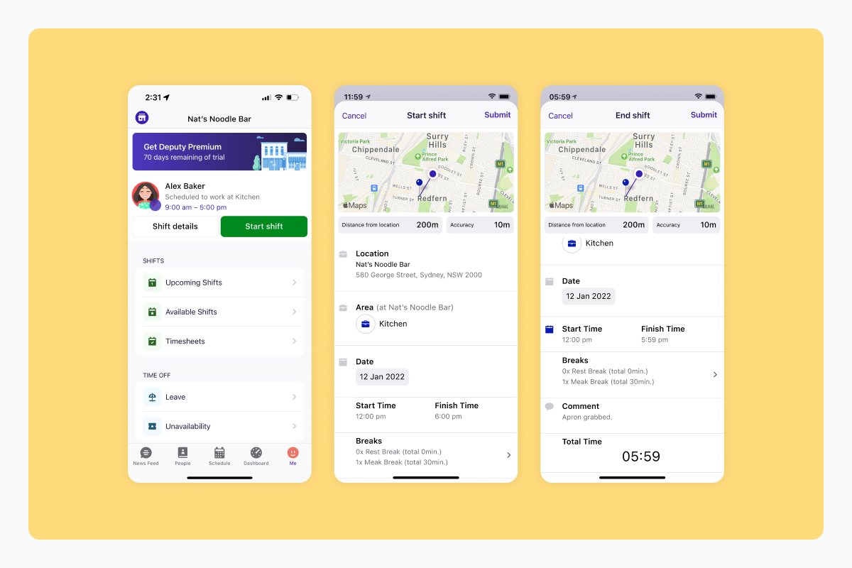
The current clock-in and out experience
Through a combination of quantitative Mixpanel data and qualitative "boots on the ground" interviews, I synthesised our findings into four key problem areas. These insights served as the North Star for our entire redesign.
Workers were often flying blind. Because the app didn't show their shift details clearly, they were never quite sure if they were clocking into the right area or if their break had actually started.
"I don’t know how to update my breaks… my pay isn’t right because my paid time worked is not properly counted."
In a busy kitchen or a crowded shop, 12 seconds is a lifetime. We saw that workers were "battling" the app. It took too many taps to do something that should be instant. Our goal became simple: give those 7 seconds back to the worker so they can focus on their day, not their phone.
When the app felt too hard to use, managers and employees stopped using it correctly. They would skip steps in the app and fix it manually on paper or in emails later. This created a huge mess for payroll.
"I manually adjust break details so my team can be paid correctly."
The clock-in screen looked and acted differently than the rest of the phone. Buttons didn't react how users expected them to, which led to accidental taps and confusion.
"It looks like I can change break types but I can’t?"
These insights proved that we weren't just redesigning a screen—we were fixing a trust issue. If we could make the app faster and more transparent, we could eliminate the "manual adjustments" and the "payday anxiety" that both workers and managers were feeling.
After hearing from our users, it was clear that the redesign needed to do more than just "look better." We set three clear goals to solve the specific frustrations we uncovered.
We needed to fit into the worker’s lifestyle, not the other way around. This meant stripping away unnecessary taps and rethinking what information they see first.
Goal: Move from a complex, multi-step process to a "glance-and-go" experience.
The clock-in screen was an outlier. By adopting modern iOS and Android patterns, we wanted to make the app feel intuitive—like a natural extension of the phone they already use every day.
Goal: Eliminate the "It looks like I can change this, but I can't" confusion by using familiar, predictable components.
We knew bigger product changes were coming. By rebuilding the foundation now, we ensured that future features wouldn't break the user experience or force managers back into manual payroll fixes.
Goal: Create a robust technical and design framework that grows with the business.
We didn't just want the app to feel better; we wanted to prove it. We tracked three key numbers to ensure we were solving the right problems.
Speed to clock-in
Directly addresses the 12-second tax. Every second saved is time given back to the worker.
5 seconds
Down from 12 seconds
Task success rate
Addresses The "am I doing this right?" anxiety. We needed to know the tech wasn't failing them.
95% success
Up from 85%
Feature NPS
Addresses The "Broken Trust" Loop. Happy workers mean fewer manual fixes and more "Happy Deputees."
56 NPS
Up from 48
A note on the 95% success rate: Our engineers were so committed to fixing the "Broken Trust" loop that they rebuilt the feature using more reliable APIs. We also added "Granular Event Tracking" so that if a clock-in did fail, we’d finally know if it was a tech glitch or a user error—no more guessing.
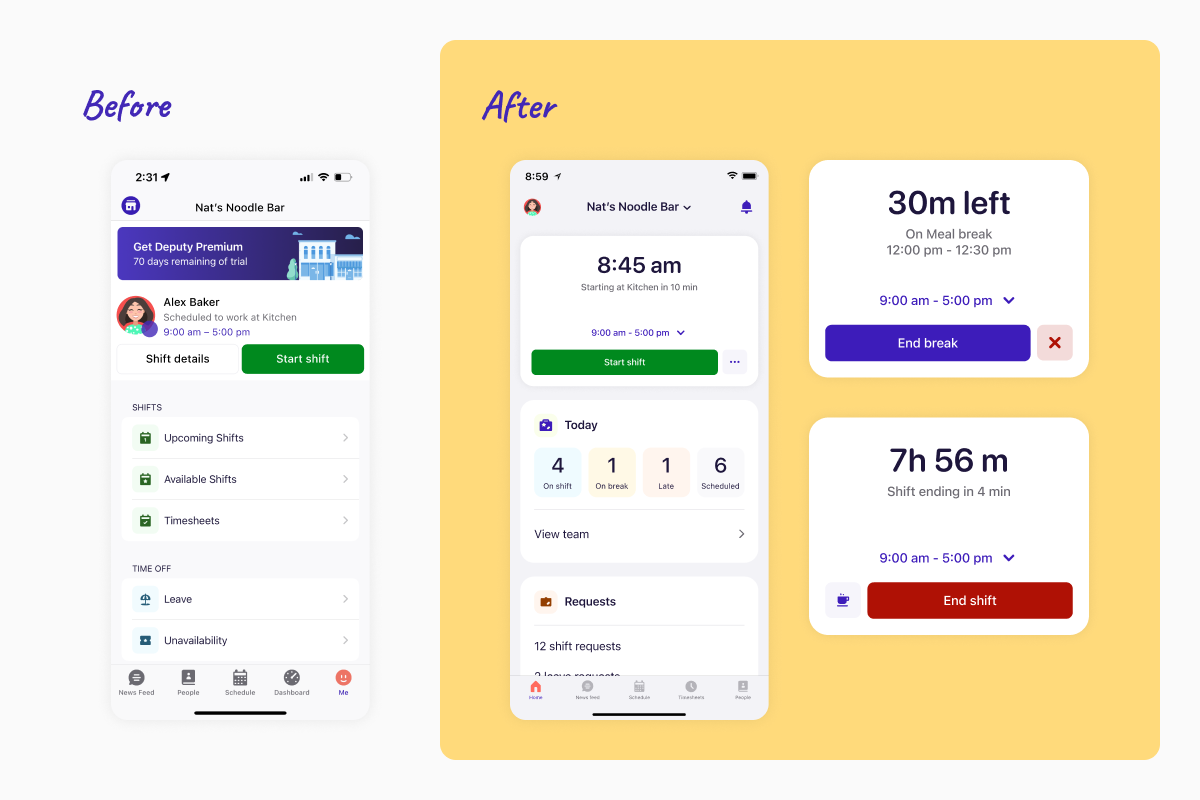
Updated design of the clock-in/out card
As the first thing a user sees upon opening the Deputy app, the clock-in/out card needed to act as a high-clarity command centre.
The existing card was lacked prominence among the other cards the Home Screen included, and often hid information workers were looking for. Our redesign transformed it into a compact, high-density component that prioritises immediate action.
Prioritising the "next step": We pushed the primary Call-to-Action (CTA)—whether it’s "Clock In," "Start Break," or "Clock Out"—to be the most prominent element. By reducing the visual noise around the button, we helped users achieve their goal in a single tap.
Context without crowding: We stripped away the fluff and surfaced only the "must-know" shift details: start time, location, and specific work area. By using a tighter information hierarchy, we ensured workers have zero ambiguity about where they are supposed to be, without making the Home Screen feel cluttered.
Dynamic states: The card now "evolves" throughout the day. Before a shift, it highlights upcoming details; during a shift, it shifts focus to break tracking and elapsed time.
This redesign was the key driver in reducing our average clock-in time from 12 seconds to 5 seconds. We turned a static information block into a dynamic tool that anticipates the worker's needs.
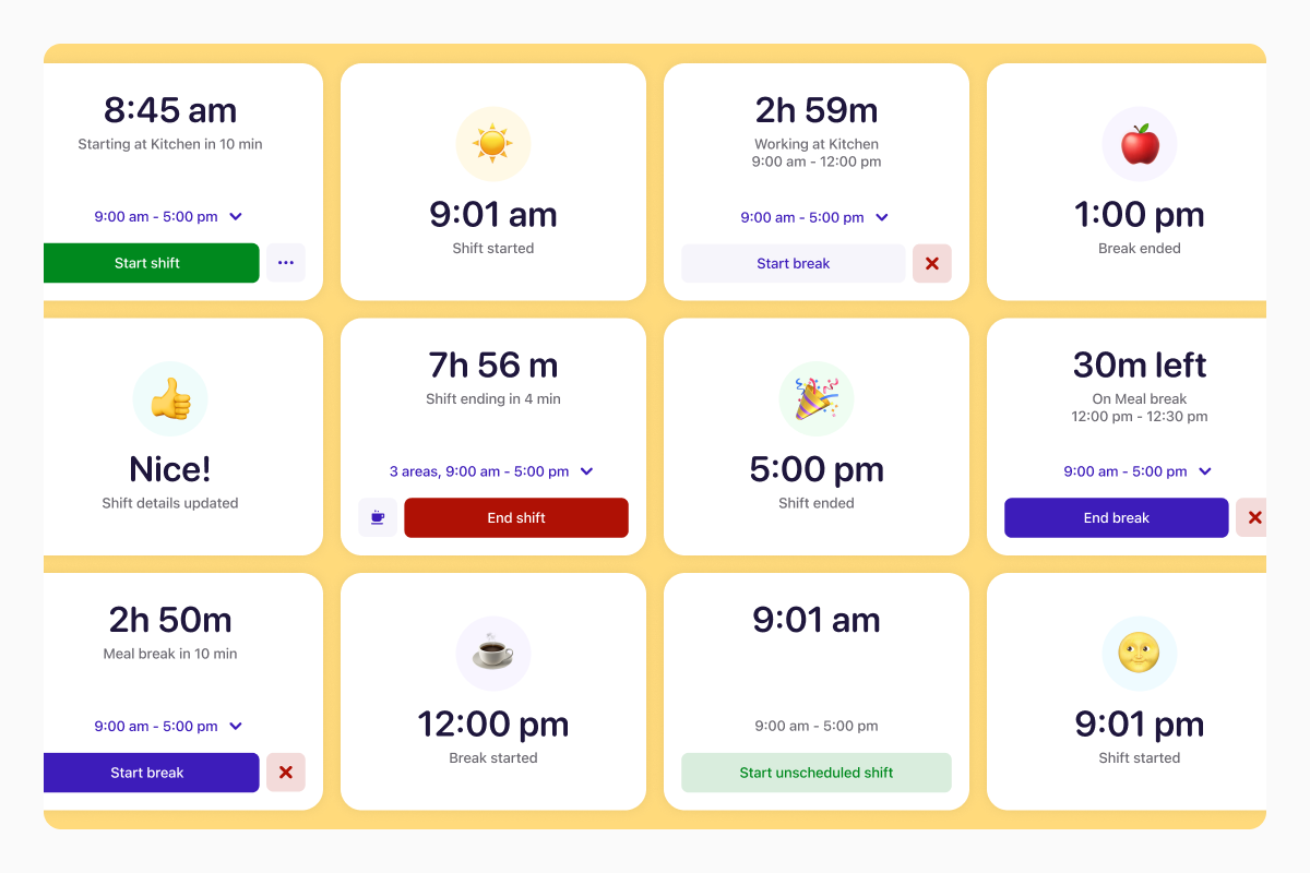
Dynamic clock-in/out card feedback
One of our key insights was the "Am I doing this right?" anxiety. Now, when a user clocks in or ends a break, the card reacts with an immediate confirmation state. This removes any doubt, confirming their action.
These reactions transformed a mundane administrative task into a small, rewarding moment of achievement. It’s this balance of functional confirmation and brand delight that helped us boost our Feature NPS and make Deputy feel like a partner in the worker's day, rather than just a tracker.
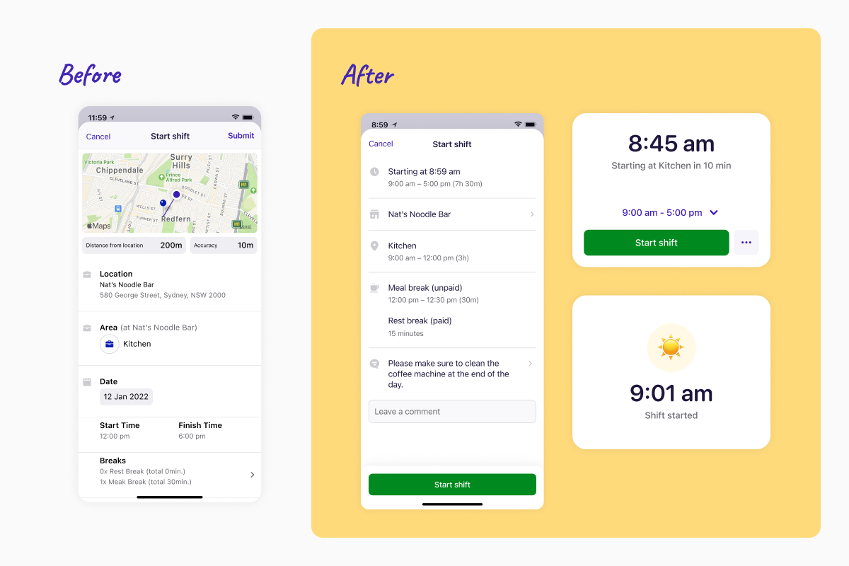
The new clock-in screen
Visual de-cluttering: The previous clock-in screen was dominated by a large geofencing map—a visual that looked impressive but added little functional value. Since geofencing occurs automatically in the background, showing the map was taking up prime real estate that could be better used for shift details.
We removed the map to create a cleaner, more focused interface. This allowed us to unify the UI with the rest of the app’s modern design system, adopting a more compact layout that surfaces all essential shift data "above the fold." Users can now see their location, role, and shift notes at a glance without needing to scroll.
Ergonomic accessibility: Recognising that shift workers are often on the move or using their phones one-handed, we moved the primary Call-to-Action (CTA) to the bottom of the screen. This optimises for "the thumb zone," making it significantly easier to reach and reducing the physical effort required to start a shift.
Streamlined hierarchy: By tightening the sizing and removing unnecessary visuals, we created a distraction-free environment. The result is a screen that feels lighter and faster, directly supporting our goal of a 5-second clock-in experience.
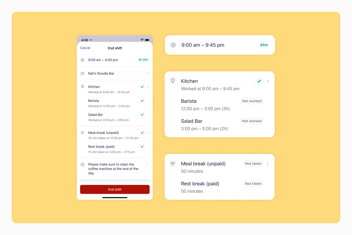
Clock-out screen including work areas
A core objective of this redesign was ensuring that our solution wouldn't just solve today’s problems, but would also serve as a foundation for Deputy’s ambitious product roadmap. Specifically, we needed to prepare for the introduction of "work areas"—a feature allowing workers to rotate through multiple roles (e.g. bar, kitchen, front-of-house) within a single shift and location.
A checklist layout: On the updated clock-out screen, we moved away from a static summary to a dynamic, modular layout. We designed a clear, vertical list of "milestones" using familiar check-mark patterns. This allows workers to see exactly which work areas they completed and whether their scheduled breaks were taken.
Visual scanability: By treating the shift summary like a checklist, we removed the cognitive load of reviewing a long shift. Workers can quickly scan the list, see the green check marks, and confirm their details with confidence before hitting the final CTA.
Adaptable UI: The interface was built to expand or contract based on the complexity of the shift. Whether a worker has a simple 4-hour shift in one area or a complex 12-hour shift spanning three departments and two breaks, the screen remains clean and organised.
By anticipating these "work area" updates, we ensured that when the feature launched, the user experience remained cohesive and required zero learning curve. We didn't just design for the current app; we designed for the future of the platform.
When budget cuts threatened our formal research phase, we didn't compromise on validation. Instead, we took to the streets of Sydney CBD, conducting 'guerrilla testing' with local business owners and staff. This 'boots-on-the-ground' approach provided raw, unfiltered feedback that a lab setting never could.
At the end of the day, our team’s dedication to the "scrappy" research and close collaboration paid off. We didn’t just meet our goals; we proved that a better user experience directly leads to better business outcomes.
Time to clock-in
12 seconds
5 seconds
-58% reduction
Task success rate
85%
97%
+12% improvement
Feature NPS
48
51
+3 points
Achieved: We reduced the "12-second tax" down to a 5-second average, giving workers their time back.
Exceeded (97%): By rebuilding the tech stack and simplifying the UI, we virtually eliminated the "Am I doing this right?" anxiety.
Achieved 51 NPS: While just shy of our ambitious target, the jump from 48 was a clear signal of success. The qualitative feedback from our direct channels shifted from frustration to genuine relief.
Product Designer
Deputy
2022 – 2023
The most significant takeaway from this project was discovering that design validation doesn't require a lab; it requires a sidewalk.When tech layoffs led to a sudden cut in our formal research budget, I initially worried it would compromise the integrity of the redesign. Instead, it forced me to get closer to our users than ever before.